Showing posts with label Grey. Show all posts

Takko Lacquer - Physical Graffiti

Hi folks!

Tonight, I have a quick little swatch of a super cool polish for you.  I am a sucker for grey polish.  I know that some people think it's drab...but I think it just looks so cool and chic when I wear it.  And this grey beauty is a stunner!  Takko Lacquer made a perfect grey crelly loaded with platinum metallic flakes.  It has a squishy look to it and the flakes are nice a flat.  They don't stick up at all!  I used two coats for this swatch with a glossy top coat.  Now for pictures!


Takko Lacquer - Physical Graffiti - McPolish

Takko Lacquer - Physical Graffiti - McPolish

Takko Lacquer - Physical Graffiti - McPolish - Macro


Oh Takko!  I just love you :)

The Takko Lacquer Shop is out of stock a this moment.  So be sure to follow Takko on all of their social media platforms to find out about upcoming restocks.  There is also rumor of a Hello Spring Sale in April.  Takkitos on sale!!  Be still me heart.

Takko Lacquer Store
Takko Lacquer Twitter
Takko Lacquer Instagram

I wish you happy Takko hunting!
- Amy McG (McPolish)

*polish provided my maker for honest review*

piCture pOlish Blog Fest 2013!

Hello everyone! This year I am very proud to announce that I am part of piCture pOlish Blog Fest 2013: The Year of the Blogger.

If you aren't familiar with Blog Fest, it's an annual celebration of piCture pOlish by bloggers worldwide. In the past it has corresponded with the release of several new colors, but this year there will be 130+ bloggers creating nail art looks using three existing shades of piCture pOlish lacquers!

Since I'm a huge piCture pOlish fan, I was so honored and excited to be asked to participate in this event!! From among the bloggers, three will be chosen to create a unique piCture pOlish collaboration shade (how awesome is that??). One winner will be chosen by Jules and Megs of piCture pOlish, one will be chosen by the bloggers, and the last will be chosen by everyone! So if you like my creation please consider voting for me. :D

The three shades that I was sent are Sky (a beautiful light blue creme), Camo (a green-toned grey creme), and Peaches n' Cream (a pretty peach-toned pink creme). Since I'm not a huge nail art person, I decided to do a geometric style of nail art rather than an abstract pattern. I created a shattered nail art look using just three piCture pOlish shades and striping tape!


If you like this shattered nail art, look no further! I've created a detailed tutorial below with complete instructions. Like I said, all you need for this look is some striping tape, and a small paintbrush, which are available at most nail polish supply stores (like Sally Beauty). If you don't have striping tape, you can carefully cut strips of cellophane tape using scissors. Just keep in mind that the width of the tape will determine your final look, so try to keep the strips thin and even.


For my particular nail art I started with two coats of camo on my index and pinky fingers, and two coats of Sky on my middle and ring fingers. This gave me a matching but mismatched final manicure, which I absolutely loved!


Another great way to wear this nail art is as an accent nail! An accent nail can tie together different polishes to create a cohesive manicure. It's also just a great way to rock nail art if you aren't ambitious enough for the entire project!


I couldn't be happier participating in Blog Fest 2013! I hope you liked my nail art creation and get a chance to try it out yourself! If you do like it, I'd appreciate your support in the contest ahead! All blogger nail art will be pinned to a Blog Fest 2013 board on Pinterest!


piCture pOlish ships internationally from their online website (check out their shipping page), and is also available worldwide through their polish network. You can also save by checking out their everyday deals!
Make sure you check out piCture pOlish on all of your favorite social networking websites: 


Butter London Posh Bird Swatches

Sometimes I see a swatches of beautiful polishes that inspire me to buy that polish instantly (usually spending more than I should, I typically don't pay retail for polishes). Butter London Posh Bird was one of these such impulse buys. I saw the gorgeous swatches by Essie of iHeartPrettyPolish and fell instantly in love. So in love that I immediately ordered it from Butter London's website for $15 plus shipping (which was quite expensive if I remember correctly) because I absolutely had to have this limited edition polish (I remember wondering how long limited edition polishes would last and freaking out that I might somehow miss it if I waited to order it). Why is it that when someone says limited edition it just makes me want it more?

So onto the polish, which I love, but sadly don't love as much as I had hoped. First of all, Butter London describes Posh Bird as a taupe glitter polish, and it most definitely is not. I think they should re-assess what they define as glitter polish because I consider Posh Bird a greyish-taupe shimmer polish. The shimmer is made up of big particles, which remind me more of foil particles than anything else. Posh Bird has the same exact finish as the gorgeous Butter London Victoriana.

The formula is the same as most Butter London polishes (and identical to Victoriana) which I happen to love, but I know some people don't care for. It's a nice thin yet opaque consistency that is easy to apply with their small short brush. This is two coats of Posh Bird with base and top coat.


Overall, the greyish-purple-taupe of Posh Bird didn't look the best with my skintone and I think I'm a little bit disappointed in it. It's beautiful, but not as unique as I was expecting and probably not worth the money that I spent on it. Sometimes though, you just have to have it.

A-England Dorian Grey Quick Swatch!

Just a quick post today! This is the unique A-England Dorian Grey. This was the only polish I purchased from A-England's Gothic Beauties Collection. I'm not a huge fan of near-black colors, and most of the other colors in that collection were very dark.

Dorian Grey is absolutely unique in my collection, it's sort of a metallic steel shimmer. It really looks like old un-polished metal, but with a blackened glowy look it it. Somehow the silver does lean a tiny bit yellow, and it wasn't very complimentary on my skintone, but I love it anyway. Something about the liquid metal nails look I'm really loving.


Do you like metallic shades? Do you have Dorian Grey?

Cult Nails Behind Closed Doors Collection (Photo Heavy)

Today I have the much-awaited Cult Nails Behind Closed Doors Collection to review for you! As you may know, I was extremely excited for this collection, and it didn't disappoint what-so-ever. But enough chatting, on to the swatches!


The names of the polishes fit well with the "Behind Closed Doors" theme, and each and every one of them gave me a little chuckle.

...to see pictures and a detailed review of each polish in this beautiful collection click read more!

Zoya Marina Swatch and Review

Hey everyone! I can't believe I missed the last day of the challenge, but I had a 38 hour project at work and didn't have much time for blogging.

Today I have a good ol' swatch to show you. I'm actually really enjoying just getting to wear nail polish for fun without having to do anything fancy to it for the challenge. I defininitely am appreciating the basics more now!

Without further ado, here is Zoya Marina. Zoya Marina is one of my fabulous blog sale purchases. It's a dark, blue-toned dark grey with frosty shimmer. The formula was nice, it seemed thin at first but was opaque in two coats that dried quickly, but I did have a few brushstrokes. I've been looking at this color for a few months so I was excited to find it on a blog sale. It's a nice dark color for fall, and the shade is neutral enough to look nice on any skintone.

Zoya Marina

Zoya Marina

I don't reach for grey very often, but every time I do I'm reminded just how much I love this color! It's almost neutral, yet unique. What's your favorite grey for fall?


A Grey Gradient

To be honest, this gradient was a complete and utter failure. I've never tried gradient nails before, but somehow (probably due to the awesome tutorials) I expected it to be easier. It wasn't! I'm not sure if I purchased the wrong type of sponge, or if I just didn't have the patience for this technique, but it didn't work for me.

I started out with a coat of piCture pOlish PMT (the light grey near the cuticles) then attempted to do a gradient with PMT, Maybelline Color Show Impeccable Greys, and Sally Hansen Black Out. I made the gradient on wax paper, carefully dipped the sponge, then pressed it to my nail. I lifted the sponge and saw... nothing! None of the gradient had transferred from the sponge onto my nail, I was left with the plain light grey of PMT with a slight sponge texture. Maybe I didn't have enough polish, so I made my gradient on the paper using more polish, pressed the sponge to it (the sponge looked perfect) pressed it to another nail and... nothing!

With my schedule this week I just didn't have time to go out and buy a different sponge  for today so I did a gradient using the somewhat-dry nail polish brush. It looked a bit neater in real life than it does in photos, but it still wasn't too spectacular..

Grey Gradient
I should have done another glitter gradient, I love glitter gradients! But this challenge is about trying things I normally wouldn't, right?

Grey Gradient

Have you ever over-estimated your nail art skills and ended up with a failure?

Dandy Nails Bathed in Light Swatch!


I wrote this post a few days ago as I'm currently preparing for my comprehensive oral examination for graduate school which is tomorrow. I have to stand up in front of 5 PhDs who can ask me any question about biology or marine biology for about two hours. The results of this exam determine whether I leave the program or officially become a Master's Degree Candidate. Wish me luck! If I don't post tomorrow it's because I failed and have to re-take the exam... in which case I will probably be too upset to post.

Today is Bathed in Light by Dandy Nails. I'd had Parallel Universe in my Etsy shopping cart for some time, but didn't ever get around to ordering it. Then I saw Bathed in Light, which is basically Parallel Universe with holographic glitter, and I had to have it. Bathed in Light is a pink/grey duochrome with tiny holo glitter in it.

The formula was excellent (which I have come to expect from Dandy Nails) and applied with ease. I used two coats and it was still a touch sheer, but I really like how it looks like this. It's soft and feminine, but with glitter and the duochrome to give it a fun kick.


Dandy Nails retails for $8 and is available from the Dandy Nails store on  Etsy

I expected the polish to be a little bit darker, but I'm still definitely a fan. This has the same glitter as Dandy Nails Look Around. It dries a touch rough but doesn't need any special attention from the top coat to be smooth as glass.


Julep It Girl Intro Box Review

What a horrible blogger I have been this week! I have been finish up my graduate classes and trying to get organized for summer research and I ran out of backup posts. Well I'm back now and I have plenty to show you. I've purchased quite a few wonderful indie polishes from Etsy and purchased supplies to do my own frankening.

Today I'm going to show you my Julep Maven It Girl Intro box. I decided after much debate to try out Julep nail polish. I've seen Julep all over the place but never wanted to fork out the cash ($14 + shipping for one bottle of nail polish?). While browsing the internet, I saw the penny deal: get a Julep Maven intro subscription for just $0.01. Seems too good to be true right? Well it's not. I checked my credit card statement and I was charged for $0.01 exactly! There doesn't seem to be any catch to this awesome deal. They shipped it to me fast and here are the results!

The Julep Maven It Girl intro box came in this cute little packaging


With a nail file and three bottles of nail polish, Heather, Mandy, and Helena.

Heather
Helena
Mandy


First up is Heather, described as: "chic platinum greige with a metallic glow." I'd say this one is a graphite grey metallic shimmer. The finish has obvious brushstrokes, but with careful application that wouldn't be a problem. Two coats + base coat for this photo. Heather really isn't a "me" color but it is pretty and the application was great.


Mandy is my favorite of the three, described as: "fresh, bright, deep coral-pink." This color is absolutely amazing. It's such a pretty color and just says SUMMER to me. It looks beautiful and bright on my fingers and I can imagine it would be a great pedicure color. It's a bit more pink than some corals (such as OPI's On Collins Ave) and did I mention absolutely gorgeous? The formula was perfect, thick and pigmented, this is two coats and top coat with no base coat.


Helena is equally gorgeous, described as "ultra-saturated fuchsia. Looks great on all skin tones." It's a great fuchsia, and it didn't significantly darker than the bottle color. In my experience most polishes this color dry matte and much more red than the bottle color, but Helena is pretty bottle accurate. This photo, on the other hand is not color accurate. I tried it outside, inside, fluorescent lighting.. but my camera can't seem to capture this color.


This is the color of Helena:


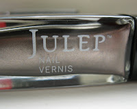
I used to think that Julep bottles looked a bit awkward because they are long, narrow, and square. After having some they are really quite nice! They have thick glass, so they are really nice and solid. The bottles nest together nicely because of the square sides and the narrow squared lid has the perfect grip for manipulating the brush. Aren't they nice?


I'm quite impressed with these three Julep polishes. The bottles are nice, the brush is great, the formula was near perfect: two coats that self-leveled and dried smooth. One quick coat of top coat and they were a shiny perfect dream. I might just have to wait and see what next month's box is like...

Wet n Wild Wet Cement Swatch.

Wet n Wild Megalast Wet Cement is actually the only grey I own! I'm not a huge fan of grey, but I knew that I needed one in my collection so I picked up Wet Cement. It is a nice taupe-grey creme. It was a great choice--easy formula, opaque in 2 coats (shown below), fast dry time, good wear time--I've got no complaints!


I actually kinda like how grey looks on me. It's just not flashy enough for a girl who loves her red. :)